
Monday, November 30, 2009
Extra Credit Fishbowl
This was an extra credit project that we had an option of doing. We had to make a fishbowl in illustrator and it was sort of hard because it wasn't coming out exactly the same. However, I think it came out really nice. We then had to place the fishbowl into an enviroment and I made a room that looks really neat. I got the desk and office equipement brushes off of vecteezy.com and I think the finished project looks awesome.
Type Portraits


These are my type portraits I had to do. The first picture is my shape portrait. We had to make a self-portrait using only letters as shapes. I had to use different fonts and sizes to create the picture, but I believe this is the strongest of mine out of all three.
The second picture is my line portrait. This was somewhat difficult and took a good amount of time to do. I am happy with the way it looks but it could look better. I used song lyrics to outline everything; Guster's "My Satellite."
The last one was the most difficult for me, the value picture. I had to shade everything in with words and it took forever. I had to use different fonts and different sizes, as well as changing the kerning/leading. I got really frustrated with this one because it was so time consuming and and it didn't really come out the way I wanted it to. Again, if I would have spent more time on it, the result would have been better. I used song lyrics for this portrait as well; Shinedown's "Second Chance."
Easton Area Chamber of Commerce Logo


This was a group project that we had to do. We had to re-design the logo for the Easton Area Chamber of Commerce. Brittany and Steve K. were in my group and after we researched Easton, we collaborated on ideas. We chose to use the bridge as the primary symbol because it is well known. The blue symbolizes water because of the two famous rivers that run through there, and because blue stands for trustworthiness/dependability. That is a good, strong color for a chamber of commerce and I think our logo came out very nicely. It portrays the message we wanted to get across very well.
The first picture is the actual logo, the second is the envelope (which I made), the third is the stationary, and the last picture is the bussiness card.
Mayfair Poster
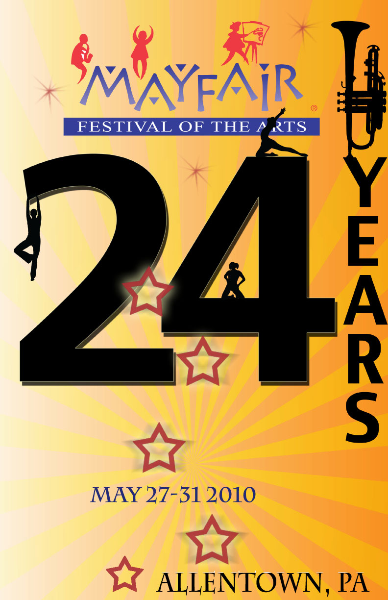
This was a simpler project I had to do. I had to design a poster for 2010's Mayfair event. The festival includes food, arts, and dancing. We had to incorporate that into the poster. I decided to emphasize the "24 years" because it was different than what everyone else was doing. The silhouettes of people looked really neat to me. I am happy with the way it came out, it could have been better if I had more time to work on it though.
Dreamscape Project


I had a lot of fun with this project. I decided to go with a travel/nature theme because I love both. I love traveling and there are so many places that I want to see; especially Egypt and London. The big clock tower from London took forever to do when I had to select it out of the other picture. I like the background because it reminds me of taking road trips, which I also enjoy. The sky is actually part of Dan Chihuly's glass art. He is an amazing glass artist who decorates ceilings with thousands of glass pieces. There are a couple places in the U.S. that I would like to visit that showcase his work; such as the one in San Francisco or Las Vegas. I just changed the color and opacity on it so it still resembled a sky. There is a globe too, with a hiker going around it. That's what I would like to do, go all around the world. The trees are really nice, they are actually brushes that I got off of brusheezy.com. I think they really finished this piece nicely. The cracks in the road were also brushes from that site, they add small details to the road so its not so plain. They symbolize my troubles in getting to visit those places so far. Hopefully that will change in my future and I will get to these destinations. The only other thing I did was enhance the color so that everything has more of a bluish tint to it. Blue is a nice, relaxing color and reminds me of traveling. I think this project came out really nice.
Time and Place Project


I found the bottom picture while i was digging through my grandmother's old photographs. This is a picture of my great grandmother's neighbor, taken somewhere in steel city. Since it is a snapshot of the entire body, I thought it would be challenging. It really caught my attention; I love the car behind the woman. I found out that it was taken in the 50's and I got all dressed up. It was extremely difficult for me to get the right pose, and to match the colors on the computer. The black of the skirt was a completely different type than that of the car in the background. The skin tones were difficult as well. The lady's skin is so whitewashed from the sun, so i had to select all of my skin to lighten it. The shadows were also hard, I didn't want to add too much. I found this project very tedious and somewhat frustrating, but is probably my favorite project I've done in this class.
Magazine Layout Project


This was our first project in class. It was the first time I learned to use Photoshop. Our goal was to create a successful magazine layout, paying attention to detail and creativity. I chose to create a New York Magazine cover because I had just traveled there perhaps two weeks prior. I found a wallpaper background on my desktop, and then added the two pictures in the windows. I actually took those photos while I was in New York and I think the merging of the pictures came out quite nicely. I am really happy with the outcome of this project.
Subscribe to:
Posts (Atom)